by BERKAY Thu Sep 30, 2010 5:58 pm
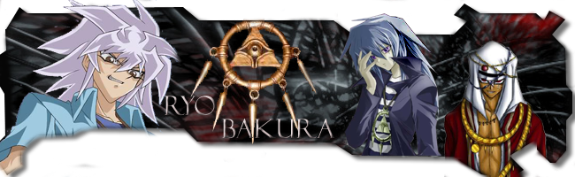
Smudge one's waves in left side look bad. These circles around the text don't look a part of this kind of work. Font type is good but doesn't match still. 6/10
I totally hate this Zelda thing. What is it? An anime? Stroke should be 1 px. I know it looks more cinematic for you, but it doesn't look good from here. 7/10
Animal themed... very nice. I guees it's a Stock. Because I know if it didn't, you'd would prefered better BG. Very impressive 9/10
Well, it's your latest's turn. Too bright and look over sharpened. Change this style your previous style was better. Like Zelda one, Bear one and more previous. 7/10